- Subscribe to RSS Feed
- Mark Thread as New
- Mark Thread as Read
- Float this Thread for Current User
- Bookmark
- Subscribe
- Printer Friendly Page
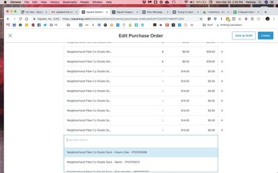
Most purchase orders I create have multiple items, each of which has a dozen or more variations. The way the New Purchase Order and Edit Purchase Order screens are formatted, it can be really difficult to add items. I can see at most three options in the drop down list that appears when I start to type an item:
The page height does not adjust for the length of the list.
In addition, some of my items/variations have relatively long names, which then make reviewing a PO as I edit it difficult, as you can also see in the above photo -- it's only possible to see each individual variation by hovering my mouse over each item or by typing a clue in the Vendor Code column; neither of these solutions is ideal.
I'd like the formatting of the New and Edit PO pages to be corrected to address these.
- Mark as New
- Bookmark
- Subscribe
- Subscribe to RSS Feed
- Permalink
- Report
Thank you @Trish_Yarn! I shared your post with the Retail team - I agree that the current layout is problematic when you have long item names and if you hvae a lot of variations. Thanks for bringing this request to our attention!
Seller Community Manager
Did you find help in the Seller Community? Mark a Best Answer to help others.
- Mark as New
- Bookmark
- Subscribe
- Subscribe to RSS Feed
- Permalink
- Report

