- Subscribe to RSS Feed
- Mark Thread as New
- Mark Thread as Read
- Float this Thread for Current User
- Bookmark
- Subscribe
- Printer Friendly Page
The title of this post has been edited from the original: Square Online: Mobile view looks oddly big.
When I toggle between Desktop view & Mobile view, the banner images looks big and cropped out or cut off on the mobile. What size banner do we need? Pixel? Help. Thank You.
Hey @Dek and welcome to the Seller Community! The typical image size for the banners is around 2000 pixels by 1000 pixels but can vary depending on the content of the header image itself.
Let me know if those image sizes help at all!
Community Moderator, Square
Sign in and click Mark as Best Answer if my reply answers your question.
Hi
The photos I have are sharp but when i upload them to square they seem out of focus and not crisp. Anybody know what to do? what size image is best to use?
- Mark as New
- Bookmark
- Subscribe
- Subscribe to RSS Feed
- Permalink
- Report
Welcome to the Community, @sharp11 -
Checkout this Best Answer by AshleyK on the perfect pixel size for your images.
I went ahead and moved your post to this thread.
If you have any issues, please let me know.
Community Moderator, Square
Sign in and click Mark as Best Answer if my reply answers your question.
This is a circular reference back to the same thread. Its very disheartening to see that Square again fails to make clear the required photo dimensions for the website sections such as banners, testimonials, etc. This particularly looks bad for Square because you are trying to encompass all of your customer needs into one platform but the real work of making these websites function properly has not been done. This isn't the first time I have seen this with Square. How about you (Square Developers) produce a reference of photo sizes (pixels) that is linked to each Square website template? Is that really so hard to do versus reading all of these frustrated users (including myself) posts over something that is so commonly addressed in the web development market?
I don't know that the issue is with the actual image size-- the problem, as I'm seeing it in my shop, is that the banner image is not being transitioned to a RESPONSIVE mode as the rest of that page's contents are. For instance, as uploaded, banner images look perfect on a full-size computer screen in all the templates I tried; BUT, when viewed on a cell phone screen, in either horizontal or vertical orientation, part of the banner image is cut off to fit the screen rather than automatically resizing responsively. I gather that this is what others are experiencing?? I agree that it would be VERY NICE to have a solution!
This is exactly the problem I am having as well. I design most my sites in Wordpress with Elementor and there is a setting that allows me to select specific image sizes for responsiveness between mobile and desktop. Considering most people use their phones for browsing now I will be sizing for mobile on here but it sure is frustrating not having an option for both. I've spent wayyy to much time trying to resolve this.
- Mark as New
- Bookmark
- Subscribe
- Subscribe to RSS Feed
- Permalink
- Report
why does the answer have to be so elusive? Square knows **bleep**well the banner sizing. They should just rite a line that states the best sizes in the same box where you upload your image. Simple.
- Mark as New
- Bookmark
- Subscribe
- Subscribe to RSS Feed
- Permalink
- Report
hi! did this ever get solved? it's 2022 and I am genuinely BEGGING for an optimised image size guide for each theme. Please god!
The website builder is a joke. Images should be fully responsive and they could be if the code was correct. The store is useless to us. Will probably continue to use PayPal for online store integration. This is the problem with "templates" you can't edit the code.
AGH this sucks so much. SQUARE!!! FIX YOUR PLATFORM!!
I’m probably super late but I have the answer you guys!
Personally, I wanted to create a banner using a logo (made transparent). I set the entire image size to 2000 x 800 px but made the logo take up only a small area of the banner in the center (about 500 x 500 px).
When I added the image to square, I customized the banner size to be “small” to ensure it shows up correctly for both desktop and mobile version (but you may have to play around with it to determine which size fits best for your situation).
I hope this helps!
Follow me on IG if you appreciate my input: @RatchetNerdGroup
This is the best answer on here..
Hey @Ratchet_Nerd Thanks for the suggestion. Mind sharing your website so I can take a peek.
- Mark as New
- Bookmark
- Subscribe
- Subscribe to RSS Feed
- Permalink
- Report
I am still having this issue.
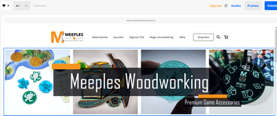
Here you can see the image as shown in the Desktop preview:

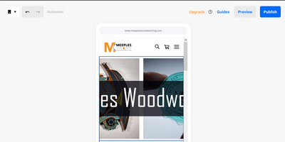
And then when I switch to the Mobile preview:

Is there any way to fix this?
Large rectangle (336 x 280 pixels)
Medium rectangle (300 x 250 pixels)
Leaderboard (728 x 90 pixels)
Half-page (300 x 600 pixels)
Information provided by the following website link:
https://blog.avada.io/resources/effective-website-banner-size.html
- Mark as New
- Bookmark
- Subscribe
- Subscribe to RSS Feed
- Permalink
- Report
For Mobile devices from the same link: https://blog.avada.io/resources/effective-website-banner-size.html
Mobile Leaderboard (320 × 50 pixels)
Mobile Full Page (320 × 320 pixels)
Square (250 × 250 pixels)
Small Square (200 × 200 pixels)
- Mark as New
- Bookmark
- Subscribe
- Subscribe to RSS Feed
- Permalink
- Report
While these are helpful guidelines, the issue is not the image size itself. The problem is that we get one banner image, and it doesn't re-scale based on platform (Mobile vs Desktop) on the Square website builder as shown in my previous images.
Hey @tilorfire27,
Thanks for reaching out to share your feedback about Square Online store images. If you have a moment, please share your suggestions on our Ideate board. Our Product Team keeps an eye on these, since they are constantly improving our products based on our seller feedback
Please let me know if you have any other questions.
Community Moderator, Square
Sign in and click Mark as Best Answer if my reply answers your question.
- Mark as New
- Bookmark
- Subscribe
- Subscribe to RSS Feed
- Permalink
- Report
I hide the header section and just use an image gallery with one image. It looks the same on mobile and desktop. Not as many games to make it look nice. Best solution I have found so far.
Ughhhh thank you for this idea. It's so frustrating that this is the only way, but I'm grateful for your answer! I just wasted so many precious minutes trying to mess around with images.
- Mark as New
- Bookmark
- Subscribe
- Subscribe to RSS Feed
- Permalink
- Report
Thank you so much! That just saved me from more headache! Definitely best answer!
- Mark as New
- Bookmark
- Subscribe
- Subscribe to RSS Feed
- Permalink
- Report
